
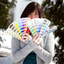


 I love words. Just look at the length of some of my posts and that should be pretty obvious! I also love, love, love me some good design. Good, old school, graphic design. Design from the mind of someone who knows their way around a trap, a kern, and some color separations. When I recently attended the National Stationery Show, I found all of that and more at Feterie. One look at the work of Feterie designer Cathe Huynh-Sison (who is also, I'm proud to say, a visitor to this blog), and it's easy to see why the company's tag line is "modern stationery and bespoken lovelies." Wow...four of my favorite words strung together with an "and." For a lover of design and writing like myself, it doesn't get better than that!
I'm always looking for something special to write on. Something cool. And for the wordy girl I am, Feterie's WordPlay Greeting Cards are perfect! I love the colors, the typographic style, and of course the sassy nod to "internetese" and how it has impacted our culture. OMG!! I can't wait 2 write some snail mail on these fab cards, LOL! See what I mean? The irony is awesome. This is also a serendipitous time for me to write about Feterie's wares as their online shop will be launching soon. I know I'm going to be first in line (or should that be ONline) to stock up on some of their original WordPlay cards, as well as their stunning Eco-Luxe gift wrap. Keep an eye on Feterie, I think there's probably lots more sassy, colorful and beautifully modern bespoken lovelies to come!
Showing posts with label national stationery show. Show all posts
Showing posts with label national stationery show. Show all posts
Tuesday, July 08, 2008
Break me off a piece of that ART!: Feterie


Friday, May 30, 2008
National Stationery Show Review, The Pen Pavilion
 At first blush, I figured "The Pen Pavilion" would be sort of boring, and there was definitely a different vibe for the most part in the writing instrument aisles (lots more men, business suits and important looking meetings going on). But a girl who truly loves paper of course loves pens and pencils too, so I had to check it out. I am attached to my ultra-fine point sharpies (perfect for writing on stardream by the way). And I have always loved drawing with roller ball pens...I'm looking at you sad collection of almost empty Pilot Precise V5 pens in extra fine point black. You have served me well.
My husband, an engineer, also enjoys a nice pen and recently introduced me to Uni-ball's Signo Micro 207. It's spring-loaded which is not a real plus for my needs, but I'll give it a chance. My three year old did some preliminary quality testing today while doodling with "Daddy's Pen" and managed to bust the spring, but it was easily fixed...so points for that Uni-ball. I'll definitely put it into my rotation and perhaps I'll sleep easier at night knowing I can now prevent check washing and make cute illustrations with a single writing instrument.
But back to the Pen Pavillion. I put aside the above preferences and found two items of interest. One was the Yoropen, a uniquely designed pen that reduces writing strain and was a NSS Best New Product Winner in 2007. I didn't get to try one at the show, but plan to try one soon. I'm wondering if it might take some getting used writing with this very different design? I'll keep you posted, and if anyone has tested one out, feel free to comment with your thoughts on it. Offered in several lines (Standard, Superior, and Executive) and styles (ballpoint, pencil, and even crayon)...there seems to be a price point to fit almost every budget. I'm thinking one of these would be a perfect stocking stuffer for my husband since the design is advertised as beneficial to left-handers for a variety of reasons.
My favorite writing instrument booth of all was Batle Studios. These graphite sculptures you can write with stopped me in my tracks they were so beautiful. The Olive Branch, Twisting Leaf, Wing and Thatcher Shell from their current collection are my favorites, along with the Calla pictured here. Stunningly crafted, these beauties won't rub off on your hand. Now if only I had an awesomely clean and organized workspace fit to place one on.
Got a pen or pencil you adore? Comment and let me know. I love writing of course, but I'm even more curious to know what other illustrators and designers like drawing with. As for the Pen Pavillion, I'm glad I strolled through. Not quite the rush I got (am I geeky or what!?) as toured the actual stationery aisles, but fun nonetheless.
Sunday, May 25, 2008
National Stationery Show Review, Part 1

I'm going to guess I need a couple posts to share all of the wonderful, new, and interesting sights I came across during my first experience walking the National Stationery Show in New York this past week. I'm still in the process of looking through all the tons of materials I brought home with me, and I'm also mulling over the direction I'd like to take my own business in over the next year. Attending the show is extremely beneficial to aspiring stationery designers, those stationers hoping to exhibit sometime down the road, or for artists wondering where to focus their creative energies. But watch out kids, you might walk out wishing you were a retailer. For those who truly love the art of letter writing, you will certainly feel the urge to shop!!!
Perhaps the most exciting part of the show for me was meeting fellow stationery designers whose work I admire and am familiar with. In many situations it was great to finally put a face to the name and/or marvelous work. First up is Jill, from Jilly Jack Designs, who was kind enough to share a photo of her hip and stylish booth for this post. Jilly Jack's designs are fresh, eco-friendly, and manage to be bold and capture a certain softness at the same time. I'm loving the line's sweet felt folio packaging, which holds and coordinates with the enclosed note cards and envelopes. Just perfect for stashing in your desk drawer.
I'm a printmaker at heart, and while etching has long been my favorite media, I'm completely enamored with the woodblock designs from Artful Sentiments. Artful Sentiments designer Molly offers a huge selection of cards offering a wide variety of images charmingly printed in bright and catchy colors. My personal choice, her lovely desk calendars which are sure to spice up any home or workspace.
Letterpress was at the forefront of the show this year. There was lots of it! I was delighted to see a few familiar faces as I walked the rows, including fellow upstate New York locals Debbie Urbanski and Harold Kyle of Smock. Debbie and Harold are committed to printing sustainably, using fine bamboo paper and all while reducing the carbon footprint of their business and giving back to environmental causes. My favorite designs from their social collection are "horsey", "ellie" and "giraffe." Too sweet. Having had some of my own work printed with Smock's parent company Boxcar Press, I have seen first-hand this shop's love for the historic art of letterpress. With their beautiful colors and deep impressions...if there is such a thing as being gorgeously green, Smock has it down. Just scroll through the images on their home page and I'm sure you'll agree.
Whimsical preppy is how I'd describe the many deliciously colored offerings from The Paper Menu. Carried by a whole bunch of authorized online and brick and mortar retailers, you should have no problem tracking down the greetings, invitations, calling cards, and much more, that designer Marie has become known for. My favorite pick from The Paper Menu? Their gift wrap that can be personalized with a message, monogram or image. I'm definitely going to be hunting that down sometime before the holidays hit!
This is just the beginning. I promise there is more to come in a future post!
Subscribe to:
Posts (Atom)


