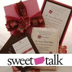


The second round of the Paper Carnival is on! A group of fabulous stationers have readied their etsy supply shops so that we can share our overstock of cards, papers, envelopes, embellishments and more, with you!! I've been stocking and re-stocking my shop, Bride Supplies all this week! Today is our turn so check it out. How about these Pink 5x7 Foldover Invitation or Program backings? Besides being just right for wedding use, they'd also be useful for baby announcements, shower invitations, or for a little girl's birthday party.
If you're a do-it-yourself bride, scrapbooker, cardmaking enthusiast, or just a paper lover you're going to want to check all the supply shops posting their paper goodness on the Paper Carnival facebook page. You can also keep an eye on the blog for more Paper Carnival related posts coming soon!
Next up, Feterie's SupplyMe Shop. My favorite listing? This gorgeous Japanese Yuzen Chiyogami Washi Paper. Bearing a traditional flying crane motif, this hand silkscreen-printed paper imported from Japan comes in two of this season's hottest wedding colors Purple and Lilac. Perfect for invitation making!
Thursday, February 17, 2011
Get your Paper Here!!!

Sunday, June 27, 2010
Do you love paper crafting?
 Well then I've got the event for you! A Paper Carnival! Right now, a bunch of fabulous stationers are readying their etsy supply shops so that we can share our overstock of cards, papers, envelopes, embellishments and more, with you!! I've been stocking and re-stocking my shop, Bride Supplies all this week! Check it out.
If you're a scrapbooker, cardmaking enthusiast, or just a paper lover you're going to want to check all the supply shops posting their paper goodness on the Paper Carnival facebook page. You can also keep an eye on the blog for more Paper Carnival related posts coming soon!!
Monday, June 07, 2010
Step right up to the Paper Carnival!

One of the coolest things about Syracuse, New York, Bride Design's home town, is the great New York State Fair. The entertainment, carnival rides, and even the butter sculpture, change from year to year. But one thing always remains the same: I come home with more fun stuff than I know what to do with (and a bit less cash). And while you might not find prizes, stuffed toys, or a tummy-ache at this carnival, you will likely go home with something way better in my opinion...paper goodies!!
So grab a deep-fried twinkie and check out BrideSupplies, our etsy supply shop. Where, in an effort to keep our studio tidy and your DIY crafting needs met, Bride Design offers our high-quality extras to you at extremely affordable prices. We offer many of our items, like these 6.25 inch Square Cheery Orange Cards, in large quantites. Making these cards ideal to use for creating wedding or large event invitations.
My favorite item in our shop right now? This gorgeous and eco-friendly lokta paper from Nepal.
Next up, fellow New Yorkers Invitations and Beyond! If you liked our overstock of metallic champagne papers, you might just want to pair them with their elegant metallic champagne "champagnium" pocket folds! Love the repousse floral pattern. If your using this gorgeous champagne color as part of your wedding, I could see using this package of 9 pocket folds to hold the invitation and itinerary for a pre-wedding girls' weekend in Chicago, wine country, or even at a resort or spa. They're that versatile.
Miss some of the previous Paper Carnival stops? Check us out on Facebook and Twitter…and happy shopping!
Saturday, March 13, 2010
Back from Beyond...
 Where have I been? Well...is there a place called "busy?" If there is, then that is definitely where I've been. Wedding season is in full swing and the studio has been bustling with activity. It's actually really exciting and invigorating!
I've also been busy with my other passion and blog Erin Illustrates! When I'm not creating invitations and wedding stationery, I'm painting and drawing these days. So please, visit me there. And as the year rolls on, I think you'll find that my passion for paper and illustration will meld further...resulting in some new ideas, products, and growth for me as designer and for the face of Bride Design. I can't wait to see where it leads!
Tuesday, November 03, 2009
Jewelry + Print Design = One Fantastic Giveaway


One of the many things I love about the stationery world, is the opportunity I've had to meet incredible fellow designers. Enter Cathe from Feterie, master of pattern and typography and all around cool girl. One thing I love about the broader indie design and handmade community are the collaborations I've seen grow and prosper between artists who work in different mediums. Enter the husband and wife design team over at Blend Creations who've partnered with Cathe to create a limited-edition, two-of-a-kind product featuring two designs from Feterie's fab gift wrap line.
Giveaway starts on 11/2/09 and ends 11/16/09. Be sure to enter HERE and while you're at it check out the many other ways to achieve additional entries. The designers will be selecting 4 winners total (each necklace has a retail value of $108) to win either the Grape Just Dots Round Necklace or the Lemon Vendome Round Necklace. Mmmm....gorgeous design and modern jewelry. My kind of contest.
Monday, September 28, 2009
It's in the bag!
I love my peeps over at Wishpot and just had to share their latest giveaway. The Wishpot team has joined forces with Avelle, the new Bag Borrow Steal, (think the Sex in the City movie) to give readers the chance at winning this fabulous fun red kate spade designer handbag! Just in time for my birthday. Holla! Retail value $429.
Here’s how to enter:
Tell, Show or Share what you want to carry in your Avelle Designer Bag!
(Your fave accessories, your pets, your dreams, the kitchen sink and more….)
Tell: for each response on the Wishpot Blog, on Avelle FB Fan Page, or on Twitter RT #Avelle, you'll get 1 entry.
Show: post a pic of what you want to carry on Avelle FB Fan Page, or on Twitter and get 2 entries
Share: sign up at Avelle, follow Avelle on Twitter or blog about this giveaway like I did, and get 3 entries. Woo-hoo!
Be sure to leave a comment on the Wishpot Blog with what you did. Giveaway lasts one week and a winner will be drawn by Wishpot on Monday Oct 5th. Good Luck and leave a comment here as well. I'm nosy like that. As for me, I'll be carrying my ipod touch, my phone, pictures of my kiddos, lots of pens, a journal and sketchbook, a load of bare escentuals and kiss my face products, and more in this bag when I win!
About the bag: kate spade ‘Quinn’ Knightsbridge Croco Tote
The clean lines and elegant croc-embossed patent leather of this kate spade tote transition effortlessly from daytime to evening. Designed to fit snugly under your arm, it’s finished with an open top, goldtone hardware, metal feet, three center compartments, signature lining and interior zip and cell pockets. Dimensions: 12"L x 3"W x 9"H. 7" handle drop.
Monday, August 17, 2009
Inspired by...
 These days, I'm deeply inspired by my garden and all the delightful things I've managed (surprisingly!) to grow along with my co-gardeners. Those would be my preschool-aged daughters, who love to water (or over-water!) our crops and who get ridiculously excited about harvesting. You should have seen the excitement over the ceremonial picking of our first cucumber this morning at 7:30 AM. I've also been really inspired by the contents of our organically grown crop-share box that we get from a local farm each week. I've discovered veggies I never even knew about, like these heirloom "dragon tongue beans." Sautée with garlic and oil for an absolutely heavenly experience! And I've been forced to be more creative with my cooking. The creativity doesn't stop there though. In these veggies, I've found new color combos, shapes, and textures that I've been recording for artistic purposes. I can't wait to begin experimenting with them this fall and I've already been thinking of ways to incorporate some of these new ideas into my designs.
It might seem odd, wedding invitations inspired by summer's vegetable bounty, but it's these types of connections that I find spur the most interesting and fresh ideas for me. I love looking at bridal mags and trends, and while I never discourage a bride from doing the same, I strongly encourage couples to explore a wide range of resources. Why settle for a wedding invitation inspired by another wedding invitation, when you can have something truly unique and inspired by YOU, the connections you've made, the things you love? Look beyond the "typical" and allow yourself to be inspired by more than just "wedding ideas."
For those brides or planners out there, what decidedly non-wedding thing, place, or theme has inspired you? Fellow creatives, what randomness has been inspiring you these days? I'm dying to know! I on the other hand, need to get down to work, creating some dragon tongue-esque invites!!
Subscribe to:
Posts (Atom)