


I'm headed out of town today and I won't be back until Monday, but I did want to leave you guys with a post while I was gone. I'm sure almost everyone who reads this blog has heard of and is more likely also a reader of Helly Becker's fabulous blog decor8. Not too long ago I was reading a really thoughtful and neat post by Stephanie over at Design Healing, where she talked about her contributions to decor8's Inspire Me Giveaway. I was so inspired I decided to clean studio myself and send a few contributions from Bride Design and Sweet Talk Boutique. The stash included fabric, papers, cards and envelopes, embellishements, notions, ribbons and more. It was a joy to compile this little package and also quite fun to see some of my lace trim and peacock feathers show up in pictures on the (newly redesigned I might add) decor8 blog. After 1,060 comments/entries (can I just say WOW) the winners were recently announced. I was so thrilled to have Bride Design and Sweet Talk Boutique listed as a contributor, beside so many other AMAZING artists and businesses (Of course I was not surprised to see a few of you guys on that list too!). This was a great lesson to me on the VERY contagious nature of inspiration! Have a great weekend guys!
Thursday, July 31, 2008

Wednesday, July 30, 2008
Down from the shelf, "Creativity for Graphic Designers"

When I'm feeling creatively spent or (I hate to admit it) a little blocked, I often turn to "Creativity for Graphic Designers" by Mark Oldach. It's not much of a picture book, which I like since most other design books are. Instead Oldach focuses on getting the most out of the creative process and more importantly the client/designer relationship. One trick of his that I quickly added to my routine while working in the corporate world was to have a "decompression" session with yourself after the initial client interview. Unloading all of the many ideas that stem from the energized back and forthing of a client meeting, while you are still energized, can be really helpful! To this day I struggle a bit when working from notes and find myself wishing I had made time to flesh ideas out further right after meeting with clients or collaborating designers. Oldach also has great tips for stretching your creative muscles, setting up all important boundaries with clients, and more...
Tuesday, July 29, 2008
Sweet Deal!
 Since I got so many great comments about my post on Kiss My Face's 3Way Color, i just wanted to follow up with a few comments from KMF Product Developer Heather, just in case anyone missed them. This delicious makeup comes in 4 shades and can be used to accent the eyes, to give your cheeks a bit of sheer color or on the lips. If you're looking for more "all over" coverage, check out KMF Tinted Moisturizers (in 6 tints).
Personally, I've got a load of products that I love from this company, especially their Obsessively Organic Skin Care line. As I've said before I've been familiar with (and a fan of) KMF products since I was a high schooler, since the company is based right next to my own little hometown New Paltz, New York (see picture above for a taste of the local scenery). I'm headed back for a visit at the end of the week and of course I'll be taking my little tube of 3Way Color with me. Most importantly, Heather also included a discount code for Design is Everywhere readers! Get 25 % discount on online purchases when you use the code KMFBLOG3 before August 7. So get your shop on guys!
Monday, July 28, 2008
Must-See Mondays: Any Movie with credits by Saul Bass
I once got to hear Saul Bass speak and share his process and thoughts on designing film titles. It was a huge highlight for me as a designer. For those that know Bass' work, the Star Wars vs. Saul Bass video I've embedded here will give you a good chuckle. Obviously it's not by Saul himself, but like any good spoof it's soooo spot on. And it's based a bit on the graphic style of Bass' work for Anatomy of a Murder.
Perhaps you've seen Bass' work in a Hitchcock movie? Psycho (1960) and North By Northwest both have title sequences that make me swoon. Two other Bass classics are the titles for Around the World in 80 Days and It's a Mad Mad Mad Mad World, where Bass channels his inner cartoonist as well as his brilliant design sense. The title sequence and the end credits for West Side Story are based on simple (but visually different) design concepts that let the music truly do the talking. Next time I need an infusion of creativity, I'm going to make a note to watch these two portions of this film (which of course is one of my all-time favorites!). If you need more evidence check out Grand Prix. I was blown away when Mr. Bass showed it on a large screen at the seminar I attended. The visuals certainly spoke for themselves, but as a design student I hung on every word this guy said. I mean where else could I hear the story of creating the titles for Cape Fear (Bass did titles for both the original and the remake), which included a picture of some highway signage from the North Carolina DOT, and a litter pan filled with water. Isn't the creative mind a beautiful thing?
If I've really got you interested, check out this site which urges you to "Forget the film, watch the titles." Enjoy!
Friday, July 25, 2008
Color on the Run!
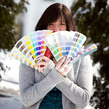
 I'm a fashion fanatic, but honestly there are times when jeans and a tee are all I can muster. I love color, but can't always get it together to apply makeup before my day has to begin. Enter Kiss My Face's 3-Way Color for lips, cheeks and eyes. Whether you are a bride-to-be, a working or a stay at home mom, a busy college student or just a low-maintainance kind of girl, this little tube of sheer natural color is the one makeup tool you won't want to leave home without.
It's no secret that I love KMF face products, but it was my newly formed gym habit that finally convinced me of this particular product's charms. After my post-workout shower I no longer look clean yet extremely over-taxed and exhausted. "Ruby" is my color of choice, and with just a few swipes and some blending...my eyes are brighter, my cheeks glow and my lips look naturally flushed. Simple AND pretty. I love it when a plan comes together!
3-Way Color is scented with truly yummy natural fruit flavors (pink grapefruit, pomegranate, raspberry and white grape for example!) and is formulated with olive and mango butter. It's gentle on skin (I can attest to that. My skin is highly ornery!) and I love that it comes equipped with an all natural sunscreen (Titanium Dioxide) as well. I was surprised that this color works as well on my eyes as it does my lips and cheeks, but it's versatility makes it just right for creating custom looks. It doesn't always last long on my eyes, but that's easily remedied with primer and I'm not looking for long-term here. I just want to get me and my preschoolers from the gym to the house as quickly and happily as possible. And if we can do it with me not looking like death warmed over...even better! Kisses to everyone over in gorgeous Gardiner at Kiss My Face!
Wednesday, July 23, 2008
Crafty Style: Textile Fetish
 I would be a sad designer, business owner, crafter, mom and friend, had I never found the creations of Jennifer Ramos of Textile Fetish. I am in luuuurve with my stylish, sushi-themed crafty work apron. Perfect for working in the studio (or around the house), it's sturdy pockets easily hold scissors, a crop-a-dile, bone folders, pens, your phone or ipod, and more. Plus, it makes me feel extra skinny when I wear it, which is a nice bonus. I don't do many craft shows, but I'd think this would be a must-have for those that do. My best friend Nicolle liked mine so much, she got one of her own for cooking!
At the National Stationery Show I got a bunch of compliments on my Textile Fetish sock monkey card holder and I can't wait to stuff a few stockings this year with these adorably green coffee cup sleeves. I'm no knitter, but my friend Cynthia is and once I saw Jennifer's knitting needle and dpn/crochet hook rolls, I knew I had to get one for her (In the skull bandana pattern of course!).
But my favorite Textile Fetish offerings by far are Jennifer's children's clothing. I mean, just look at the Mod Jumper...could there BE anything cuter?! I love the added touch of the vintage buttons. And I know I need to get a couple tiered skirts for my girls who love to twirl. Recently, we took a family trip over to the Farmer's Market in Ithaca and everyone we met gushed about the gorgeous pants set from Textile Fetish, not unlike the one shown here, that my daughter was wearing.
It is such a joy to dress yourself or those you love in handmade garments. I'm sure that joy is doubled when you actually made the garment yourself. But while I may have my own textile fetish, my sewing skills don't quite see the action they used to. Textile Fetish's offerings are beautifully crafted with high quality fabrics, in the coolest of patterns. I really enjoy Jennifer's fabric pairings and feel she sincerely considers the end-user in her designs. Her kids clothing is roomy for lots of active play, but fits well (a good fit can be tough to come by in Toddler sizes). So whether you are an artist, a best friend, a kid, or a coffee cup....you might benefit from knowing about Jennifer's wares. As I said before...I'm glad I found Textile Fetish!
Wedding Wednesdays: MOB vs. MOFG
I love weddings, but these days I'm usually just a vendor. But when my youngest sister got hitched last summer, I had the distinct pleasure of being both a Matron of Honor and Mother of a Flower Girl. Mercifully, I was allowed to split these duties with my other sister. I had an incredible time and it's a night I won't soon forget! I'll also say that being Mother of a Flower Girl wasn't exactly easy. Especially the part where I had to chase a two year old at top speed in full make-up and hair, while sporting a slightly tight bridesmaid's dress and heels, on concrete no less. A truly joyous occasion, my daughters and niece definitely got into the spirit. They taught me that while most all mothers approach a wedding day and their daughters' involvement in it with love and care, that approach varies a bit depending on whether your daughter is the bride or the flower girl. For example,
Mother of the Bride: Watches lovingly as her daughter and husband dance the father daughter dance.
Mother of the Flower Girl: Looks on in horror as her daughters and husband do the dance of "Try and stay still, don't bang on the glass! Here, you need some goldfish? NOOO! Not on your dress!!!!..." in the church's crying room during the ceremony.
Mother of the Bride: Acts as hostess and thanks guests for coming
Mother of the Flower Girl: Tries not to act shocked when she thanks guests for complimenting her child on their good behavior (Uum, were we watching the same child?!)
Mother of the Bride: Helps daughter pick out her dress and attends fittings
Mother of the Flower Girl: Helps daughter into her dress, usually with a struggle, and attends to any stains or damage (Got baby wipes?)
Mother of the Bride: Holds back tears of joy as her daughter says "I do"
Mother of the Flower Girl: Holds back a smile as her daughter asks the priest "Is that your friend Jesus?" at the rehearsal (True story).
That's just a smattering of responsibilites. Believe me, I'm not saying Mothers of the Bride have it easy. My Mom spilled champagne on her dress before we even left the house. But she did handle it with grace—a trait that most mothers of toddlers have to just learn to live without until their kids are at least 6 right?
Graceful or not, children often bring a unique charm and enthusiasm to their part in a wedding. And I don't think my sister, the bride, would have had it any other way. Having my children involved in such a meaningful event, also reminded me why I love weddings so much...celebrating a couple's love and the merging and growth of two families. Any fun flower girl/ring bearer stories out there? Do tell...
Tuesday, July 22, 2008
Siblings share the news!
 When there is news to be told, my daughter loves to be the one to tell it. So when I gave birth to her sister (yikes, almost 2 years ago!), I figured she should do the announcing. While I love birth announcements of all types, my favorite ones to design these days are the ones from the big brother or sister. I'm not the only one who loves letting the siblings spread the news. Check out these darling (and funny) announcements from Petite Alma for Tiny Prints. So sweet.
The announcement pictured here was a great excuse to take lots of pictures of my little girls and go hog-wild with the pinkest papers I could find. The sash slides off to reveal all the important baby stats. Now that they're 3 and 21 months, I have no want for pink in my life. It's Daughter #1's favorite color (of course) and the first color Daughter #2 learned. Of course the second color she learned was purple. Looks like Daughter #1 is quite the little art instructor.
Monday, July 21, 2008
Must-See Mondays: Helvetica
I'm sure by now all my fellow design nerds have seen the feature length, 2007 documentary "Helvetica." Besides the awesome interviews with "celebrity designers" (OK maybe they're only celebrities in the graphic design world) and theorists, I promise that even the most jaded designer will be stunned by the fact that Helvetica is literally used EVERYWHERE. Yes, EVERYWHERE. Did I know this? Pretty much. I knew it was used by Massimo Vignelli when designing the identity and signage for the New York City Subway System and the like, but geez...the opening segment alone will remind you that Helvetica is no longer just "classic" or "standard." It's ubiquitous, pervasive (almost viral), and well, like I said...EVERYWHERE. It's so all over the place that I almost forget I'm looking at Helvetica sometimes. Which is actually why some designers think it's so great.
Of course, for those who know the aesthetic of the various designers included in the documentary, you'll probably react as expected to each of the interviews shown (based on your already formed opinions of said aesthetics). For me it went kind of like this...I wished I worked for Michael Bierut, would love to listen to records with Stefan Sagmeister and hear his thoughts on music and design, realized I dislike David Carson a little less than I thought, and wanted to give Tobias Frere-Jones a big kiss (total font crush!). The most interesting part of the film for me was definitely the historical information about the creation of font—the details and the human interest side of the story. Listening to Hermann Zapf...totally awesome. Seeing Matthew Carter work and talk about the alphabet was also pretty exciting (wow, I AM a nerd!) and very impressive. Eric Spiekermann gave me a chuckle. And it was cool to learn more about firms like Experimental Jetset and Norm, which I hate to admit I hadn't heard of (see I do have a life outside design!).
To sum up...if you like typography, I think you'll enjoy this one, no matter what your thoughts on Helvetica itself. Honestly, I rarely use the font. When I'm going san-serif, I'm more of a Futura, Century Gothic, Frutiger or Univers gal (depending on the occasion). I always shied away from Helvetica on principal, thinking it was just so familiar or overused, but this movie had me considering Helvetica and it's strength and weaknesses more deeply. Perhaps it is the near-perfect, universal font with unprecedented legibility and without excess thematic baggage, that many think it to be. It may not be tomorrow, or next week, but maybe someday I'll find the right moment or job and give Helvetica another chance. Thanks for the encouragement design celebrities! I think...
Thursday, July 17, 2008
An Artist's Hotel Bar Tour In NYC: Bemelmans Bar at The Carlyle
 You probably know Ludwig Bemelmans as the creator of Madeline, a plucky children's book heroine from Paris. What you may not have known is that the Carlyle Hotel, at Madison and 76th, is home to a bar named after the famed illustrator and author. According to the Carlyle, the hotel was New York's luxury residence du-jour when Bemelmans was commissioned to paint large scale murals in the hotel bar in 1947. In a turn of total brilliance (if you ask me), Bemelmans bartered his mural work for a year and a half of accommodations for himself and his family. Simply awesome.
This classic New York haunt, Bemelmans Bar, was the second stop on our Day-After-Christmas Hotel Art Bar Tour (I posted about the St. Regis' Old King Cole Bar Lounge on Tuesday). From the authentic prohibition era cocktail menu (I recommend the Gin-Gin Mule...gin, homemade ginger beer, fresh mint, and lime juice) to the leather banquettes, the cozy atmosphere evokes a feeling of nostalgia... almost as if you're in old Manhattan. From the walls to the lampshades, almost every surface in the place are kissed with Bemelmans' signature style. The murals depict Central Park, but Bemelmans-style. Rabbits out for a picnic, a balloon vendor, artists painting al fresco (and of course a special stateside appearance of Madeline)...the bustle of the park is perfectly captured, but with a whimsy and charm that only Bemelmans brush could imagine. Bemelmans is pretty upscale and that is reflected in the pricing, but again...for a special occasion it's a great place to visit and definitely worth the stop.
Like Parrish's Old King Cole, The Bemelmans Bar murals were also given a touch up in 2002. I look forward to returning to this swank grown-up scene, and as luck might have it I could return sooner than planned. This time with my own little girls in tow! Every weekend The Carlyle hosts Madeline's Tea Party at Bemelmans Bar. With treats like Petite Banana Splits Fontainebleau, a storyteller spinning our favorites (Madeline's Rescue and Madeline and The Gypsies, come to mind), as well as songs sung from the Madeline songbook...it shouldn't take much to get them on board! Besides...who doesn't love a day out in NYC. On my list for Future Art Bar Hotel Tours The Monkey Bar at the Hotel Elysée (complete with a 72 year old mural of simian monkeys (of course!), and a visit to Everett Shinn's murals at The Plaza's Oak Bar. So much art, so little time!
Wednesday, July 16, 2008
Wedding Wednesdays: Unique Guest Book Alternatives

 As much as I love the hand-bound guest books I've created over the years (including my own), the tide seems to have changed. A traditional guest book is perfect for some couples, but many brides want more than just something that will sit on a coffee table. Or sit on a coffee table and eventually get moved to drawer.
You might be surprised at the variety of non-traditional guest book options available. And I'm even talking about going beyond the signature photo mat, an idea that I'd say came about in the last 10-15 years but which has become pretty standard and traditional in that time. How about a keepsake guestbook tray that guests sign with an engraving pen? This can also be done with unglazed ceramics, that you can later glaze and fire. These Wish Trees I found over at Here Comes the Guide are stunning! Of course you could always put a new twist on the old guest book tradition and go with a book that combines guests signatures and photos. More and more wedding photographers are offering this as part of their engagement and wedding services these days.
After creating an invitation suite for one of my favorite brides Lucia, she shared with me her plans to create a "Make-a-Wish, Take-a-Wish" bowls for her reception. I loved her idea so much I fashioned my own version for my sister Devon's wedding last year. The premise is pretty simple. Two jars (bowls, or vases work well too), one for guests to write wishes or bits of advice for the happy couple (Make-a-Wish) and another bowl filled with well-wishes from the bride and groom for their guests to take home (Take-a-Wish). Most of the wishes my sister chose to include were Irish blessings, delightful proverbs from around the world, and even a few affirming mantras. We also included a framed poem, along with instructions on how to use the jars, on the table. Everything was done to match the colors and scheme of the event and guests enjoyed the interactive aspect of this keepsake. Cards can be stored in a variety of ways, in a photo book interspersed with pictures or a lovely box are fun choices. Extra special notes might also be framed and placed in the newlyweds' home.
I truly enjoyed making these and would love to make more custom "Make-a-Wish, Take-a-Wish" bowls in the future. But, this is also a pretty easy project to DIY and put your own spin on. Have fun and if you do make your own send pictures! I'd love to see them and share them!
Tuesday, July 15, 2008
An Artist's Hotel Bar Tour In NYC: King Cole Bar Lounge at the St. Regis

As a freshman in art school I became enamored with Maxfield Parrish. A highly innovative and creative painter, Parrish also had an illustrious illustration career. You know when you've had a color named after you ("Parrish Blue" in this case), that you've pretty much made it in the art world. Not long after discovering Maxfield, I determined I needed to see his work in person. Did I head to the National Museum of American Illustration in Newport, Rhode Island (a state I used to live in no less!)? No. How about the Philadelphia Museum of Art? Nope. Instead, I waited 10 years and dragged my family on a hotel bar tour around New York City. And one freezing cold late December day, I got to warm up with a cocktail and some bar snacks, while sitting in front of Parrish's 1906 mural depicting Old King Cole. Forget summer vacation at the beach, I'll hold out for a brisk wintertime walk down 5th!
Located in the posh St. Regis Hotel (55th Street B'twn 5th and Madison), the intimate and inviting King Cole Bar Lounge is tucked away from the vaulted ceilings and gilded interior of the hotel's expansive lobby. Dark wood and dim lighting in the seating area make for cozy conversation. They serve their function and then fade into the background letting the true star in the room shine, Parrish's mural. I've heard the bar can be packed to the gills with a ritzy after work crowd, but during our visit it was quiet and subdued. Most patrons seemed to be shoppers dashing in from the cold for a quick drink or regulars chatting with the bartender. Drinks are pricey, but the family agreed this was a special occasion and the atmosphere is worth the price of admission alone.
Since I took the picture above, Old King Cole has been restored. After being taken down in January 2007, everyone's favorite merry, old, soul, was given a cleaning and returned in late Spring 2007. I can't wait to make a trip and check out his new glow. A lot has changed on my end too...the family has grown with marriages, pregnancies, new houses and moves. As a result we haven't taken another tour, but I'm already compiling my list of hotels (and lining up a sitter!). I was shocked at how my entire family, creatives and non-creatives alike, truly enjoyed this jaunt. I get lots of "when are we going to do that again!?" Hmmm...just as soon as that crisp city weather rolls in and I can line up that sitter.
Thursday, stop in for the second stop on our tour...where I had drinks in the park with one of my all time favorite authors!
Monday, July 14, 2008
Must-See Mondays: Sigur Rós - Heima
Break out my Fair Isle sweater. I'm moving to Iceland. A year ago the band Sigur Rós did a brilliant and beautiful thing. A series of 15 free, unannounced concerts in their homeland over two weeks. What's even more brilliant is that they filmed it all (the film's title 'Heima' is Icelandic for "at home"). The Husband knows I'm a fan of this band and as a result, did me a total solid by unexpectedly DVRing 'Heima' when it aired on IFC Friday night. Sort of romantic, huh? I kinda thought so.
'Heima' is part intimate concert film, part documentary. I can't describe it better than this one quote from the band's website "'Heima' also serves as an alternative primer for Iceland the country, which is revealed as less stag destination-du-jour and more desolate, magical place where human beings have little right to trespass." Words like magic and desolate only scratch the surface in describing the incredible images that pack this movie from start to finish. I mean, just have a look at the trailer...
A bright yellow dress reflected in slick midnight blue sands, a visual symphony of circles lining a decomposing factory wall, a stack of school room chairs piled high to create a geometric backdrop for a heartfelt song. Design and music have always been deeply fused for me. But 'Heima' takes that combination to a new level, and wraps it up in the quiet, simplicity, and the majestic strength that is Iceland and it's people. If you'd like to see more, do yourself a favor and check out this excerpt from the film, a song entitled "Agaetis Byrjun."
What truly amazed me most about this film, besides it's look and aesthetic, was that these concerts attracted whole villages. I mean EVERYONE, from 80+ year old grandparents to babies. And it worked. Actually, it was so touching it made me cry. That sort of coming together is rare in the United States (and many other countries as well). Rare, and very, very beautiful.
Friday, July 11, 2008
Beautiful Budget Wedding and Event Design Ideas
 I love helping hosts, especially brides, make their wedding vision come to life. It's even better when I can help them work within their budget. I refuse to sacrifice style and quality of workmanship, so often times my money-saving solutions come in the form of "killing two birds with one stone." Such is the case with the table number towers I've created.
These lovelies serve as table numbers (or names) on two sides of the square. They can also include fun trivia about the bride and groom, a message of thanks, a note about a charitable donation in lieu of favors, or as in the case of these towers, a menu, on the other two sides. These pearl and ivory towers photographed by Laura Brazak, were a big hit with the couple and guests alike.
Other budget friendly stationery design techniques that I like to use are a postcard response, for more casual weddings (fun and they save on materials and postage), and menu or favor cards tucked inside an envelope that can serve as your place cards. These envelopes look charming addressed and lined up on a table at an event. They're also stunning pinned to a fabric covered board placed inside an open frame. My favorite part of these envelope/place card combos is that the various table names or numbers are printed in the menu or favor card that goes inside the envelope. Only the guests names appear on the outside envelope. Are you thinking what I'm thinking? Yes, that means the event hosts or planners can make last minute table additions and switches with ease and without stress (and without having to call the calligrapher when time is running out!).
Bride Design offers table number towers like the ones featured here starting at $15 each. They're shippable nationwide, made with the finest papers and embellishments, and can be created to match the color scheme of any wedding or event. For more info on these, our invitation suites, or other reception items, head to our website or contact admin at bridedesign dot com. Happy planning...and never ever give up beauty for budget! Hopefully these ideas prove you don't have to!
Wednesday, July 09, 2008
Looking Closer
 Yesterday I met with a corporate communications director. My corporate graphic design portfolio which deals mostly with print publishing (book and magazine) identity and corporate communications, was a bit dusty. It's been a while since I talked about the annual reports and direct mail pieces that used to be my bread and butter. Now that I am a mom I mostly talk about bread and peanut butter. Since I've evolved to be as much entrepreneur as designer, I think about business and strategy almost as much as I think about aesthetic. Since most of my work is now stationery and couture invitations, my life revolves around hosts, guests and events, rather than editors, buyers and drop dates. Showing this portfolio was fine, I really enjoyed the discussion as well, but I was reminded that I love what I do now too. I also remembered that the graphic design student in me is very much alive. All artists constantly grow and change, but the one thing that never seems to change for me is my desire to learn more about design.
When I graduated with my BFA in 1995 I attended the International Design Conference at Aspen. It was a dream for me to attend. While there I picked up a copy of Looking Closer: Critical Writings on Graphic Design. I have read and re-read many of the articles housed in these pages over the years. "Why Designers Can't Think" by Michael Bierut has got to be one of my all time favorite essays on design education. Having been schooled at a university where visual problem solving was valued first and a slick portfolio came second, this article reminds me of my duty to make everything I touch attractive, legible and appropriately communicative. Famed children's book illustrator and graphic designer Leo Leonni's article on "The Urge to Make Things" is another favorite that captures the designer as artist. And as a designer in book publishing I found William Drenttel's essay on the written word, to be a valuable resource on a daily basis.
I could write FOREVER about the great modern and post-modern, and post-post-modern graphic designers of our time (do I feel a new blog feature coming on? Would you guys even want to read about Massimo Vignelli or David Carson?) and how they influence what I do today (make wedding invitations...wha?). I know it sounds crazy, but as I design stationery you'd be surprised at how often some of these pioneers come to mind. I mean, how awesome was Bradbury Thompson?! The guy tried to revolutionize the alphabet, by using only one symbol for each of the 26 letters. Alright, this design nerd sees that you are glazing over and clicking onto another blog (I know that look and I am not offended, I used to teach design to liberal arts undergrads after all). I'll wrap it up by saying that as a designer what I design may change and the passion with which I design it may ebb and flow, but for those who truly love what they do, the initial spark in some way, shape, or form will always be there. Sometimes I've had to dig deep to access it, but when I do even that smallest spark has lit my way.
Tuesday, July 08, 2008
Break me off a piece of that ART!: Feterie

 I love words. Just look at the length of some of my posts and that should be pretty obvious! I also love, love, love me some good design. Good, old school, graphic design. Design from the mind of someone who knows their way around a trap, a kern, and some color separations. When I recently attended the National Stationery Show, I found all of that and more at Feterie. One look at the work of Feterie designer Cathe Huynh-Sison (who is also, I'm proud to say, a visitor to this blog), and it's easy to see why the company's tag line is "modern stationery and bespoken lovelies." Wow...four of my favorite words strung together with an "and." For a lover of design and writing like myself, it doesn't get better than that!
I'm always looking for something special to write on. Something cool. And for the wordy girl I am, Feterie's WordPlay Greeting Cards are perfect! I love the colors, the typographic style, and of course the sassy nod to "internetese" and how it has impacted our culture. OMG!! I can't wait 2 write some snail mail on these fab cards, LOL! See what I mean? The irony is awesome. This is also a serendipitous time for me to write about Feterie's wares as their online shop will be launching soon. I know I'm going to be first in line (or should that be ONline) to stock up on some of their original WordPlay cards, as well as their stunning Eco-Luxe gift wrap. Keep an eye on Feterie, I think there's probably lots more sassy, colorful and beautifully modern bespoken lovelies to come!
Wednesday, July 02, 2008
Win with Weddiquette!
The Weddiquette Blog is hosting its first give away and Sweet Talk Boutique has the honor of being featured! Comment on Weddiquette's give away blog post and let them know which listed items you would most like to have either for yourself or perhaps a bridesmaid or new bride. What's in it for you? A $30 value, that's what! That's TWO cookie greetings or Invitastions for you! Or for you and a friend. Or for two friends who you can convince to share their cookies with you...(I'm sneaky eh?). Jen and I can't wait to see who the winner is, so I can get designin' and Jen can get cookin'. And "Voila!" your cookies are on their way.
While you're there, take a look around Weddiquette's site. From wedding etiquette, to style, and planning, Weddiquette offfers a ton of wedding related dos, dont's, links and tips. I sure could've used this site when I was getting married. So if you're getting married, know someone who is, or heck...if you just want to try and score yourself some free cookies...get on over to Weddiquette and comment baby!
Subscribe to:
Posts (Atom)


